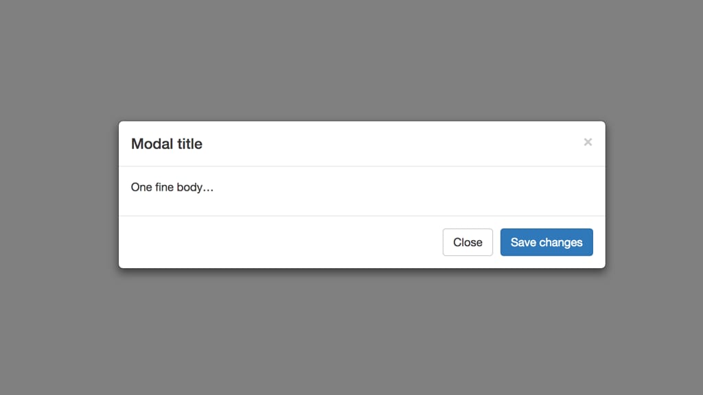
The Bootstrap Modal component is nice and simple to use but it lacks one thing out of the box, and that is the ability to center it on the page vertically.
Bootstrap 3 was released back in 2013 and the CSS landscape was much different then. Now we have a lot of new tools, and Flexbox is one of those new tools that is a simple solution to this problem.
Here is a CodePen showing how it can be achieved:
See the Pen Bootstrap 3 Centered Modal with Flexbox by Eric Barnes (@ericlbarnes) on CodePen.
The two CSS selectors I added are the following:
.centered-modal.in {
    display: flex !important;
}
.centered-modal .modal-dialog {
    margin: auto;
}
Set the .in as a display flex, and it has to be defined as “!important” because Bootstrap itself puts a style="display: block" in the DOM once it’s opened. Then in the .modal-dialog set the margin to auto, so it’s centered on the screen, both vertically and horizontally.
Thanks to Flexbox creating a vertically centered Bootstrap modal window is now easier than ever.